VGR – Health Care app
Ethics for UX Designers
The course focuses on universal design, accessibility, norms, ethics, and dark patterns. It explores the significant role UX designers play in our industry and how we can contribute to a more inclusive language
Background
The VGR app brings together all of VGR’s healthcare e-services in one convenient place.
The goal is to simplify things by centralizing them. The vision is to present services individually, tailored to each person’s health status. This way, everyone has the best chance to participate and take control of their own health.
Assignment
We will analyze and provide suggestions for improvement or redesign, taking into consideration norm criticism, accessibility, and dark patterns
- 4 UX Designer
- 7 Weeks
- Figma, Miro, Canva
Discover
We started with secondary research and benchmarking, where we analyzed both our app and competitors’ apps with a focus on standards, sustainability, and accessibility. Specifically checking out Doktor.se, Kry and Doktor 24.
We conducted both manual and automated accessibility tests, which revealed that the VGR app does not meet WCAG 2.1 standards, as also mentioned in the accessibility report for the app on VGR website.
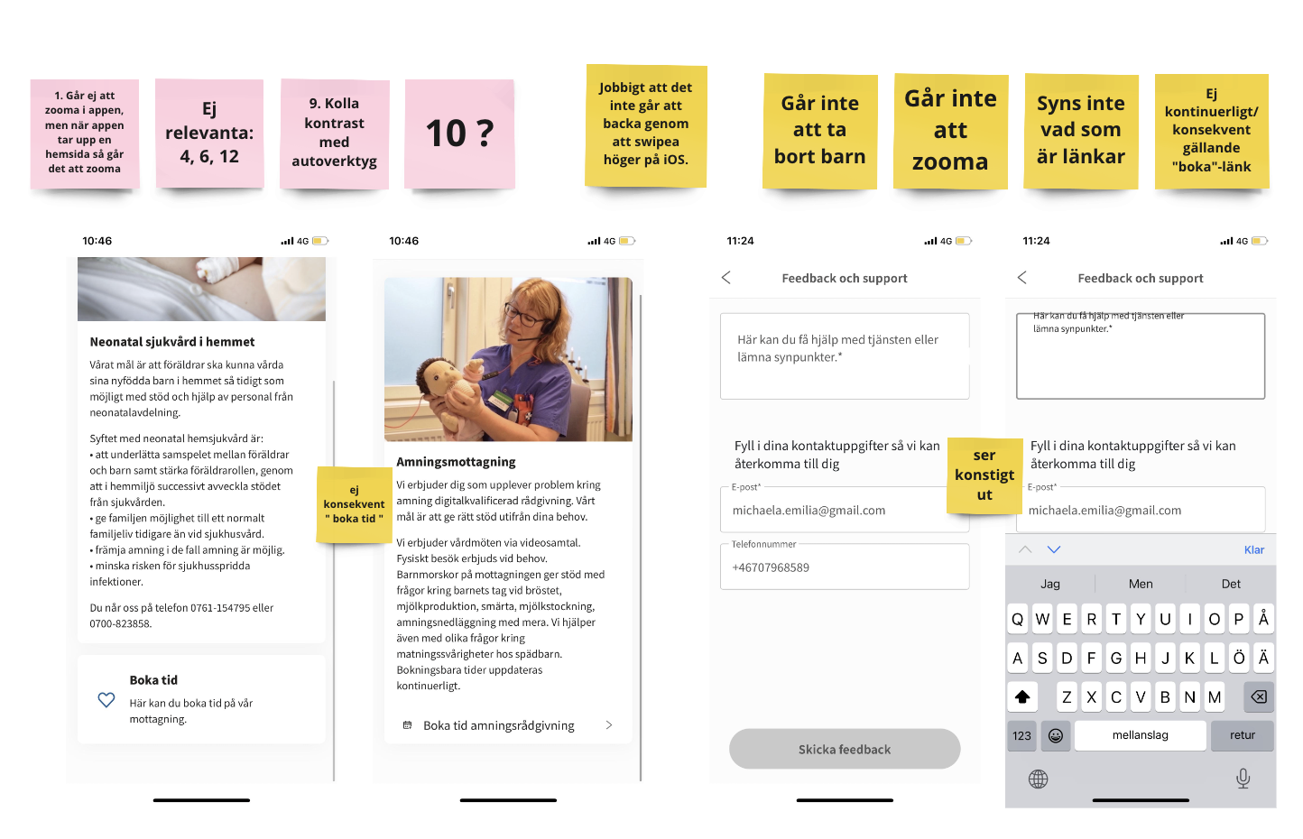
Insights we got is that in terms of accessibility, we found the most deficiencies, and therefore, we chose to continue with it as the main focus.
The fact that an app for healthcare, aimed at all residents in VGR, has these shortcomings, excludes a significant number of people in an already vulnerable situation, and that is what we want to change.
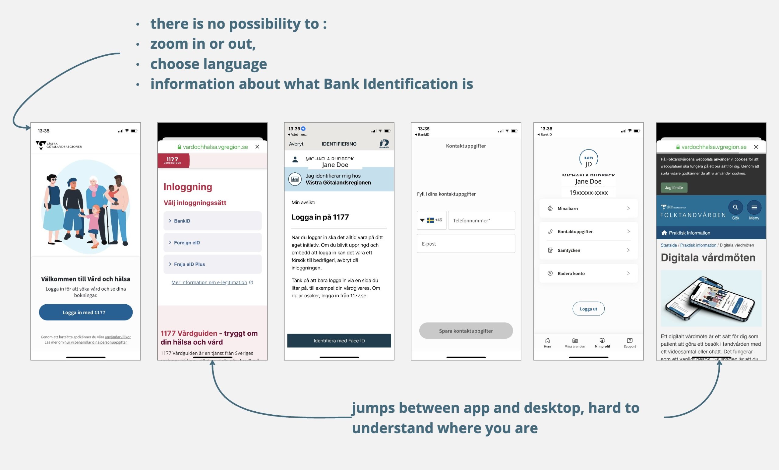
We found an app with a:
Lack of structure and flow. It was difficult to navigate and find the right information within the app.
Lack of feedback and error prevention. We, as tech-savvy individuals without disabilities, had difficulty interpreting icons and purpose.
Uncertainty and insecurity. We felt that the app created these feelings. This was even more noticeable for our interviewees.
How might we” was put together with the help of our insights. And it became the following…
HMW…”redesign the app based on universal design, so that adult residents can use it on equal terms?”
Define
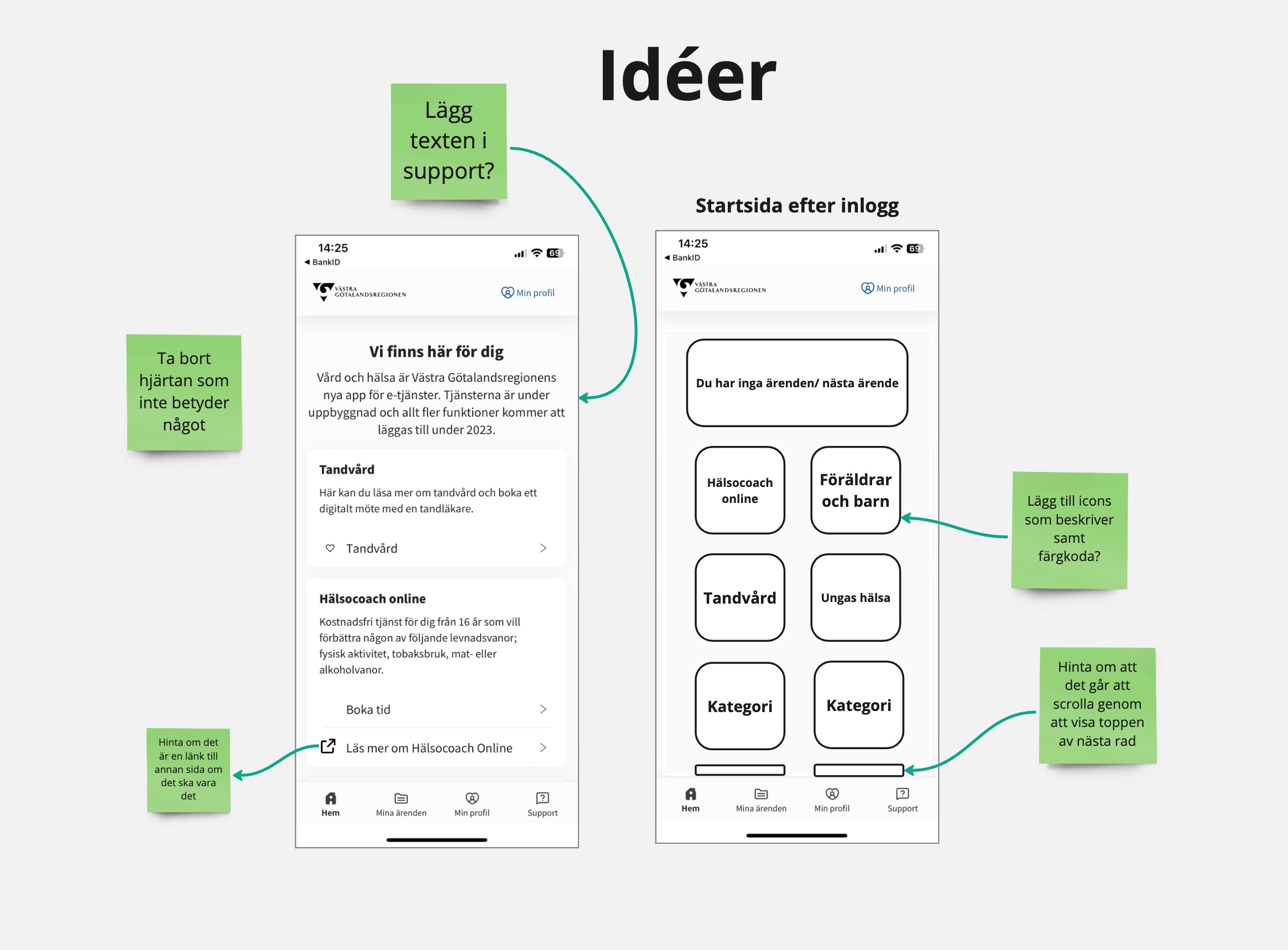
We started with idea generation, exploring various concepts for the different views we have focused on. Through sketch storming and dot voting, we arrived at the final concept
Deliver
Original view
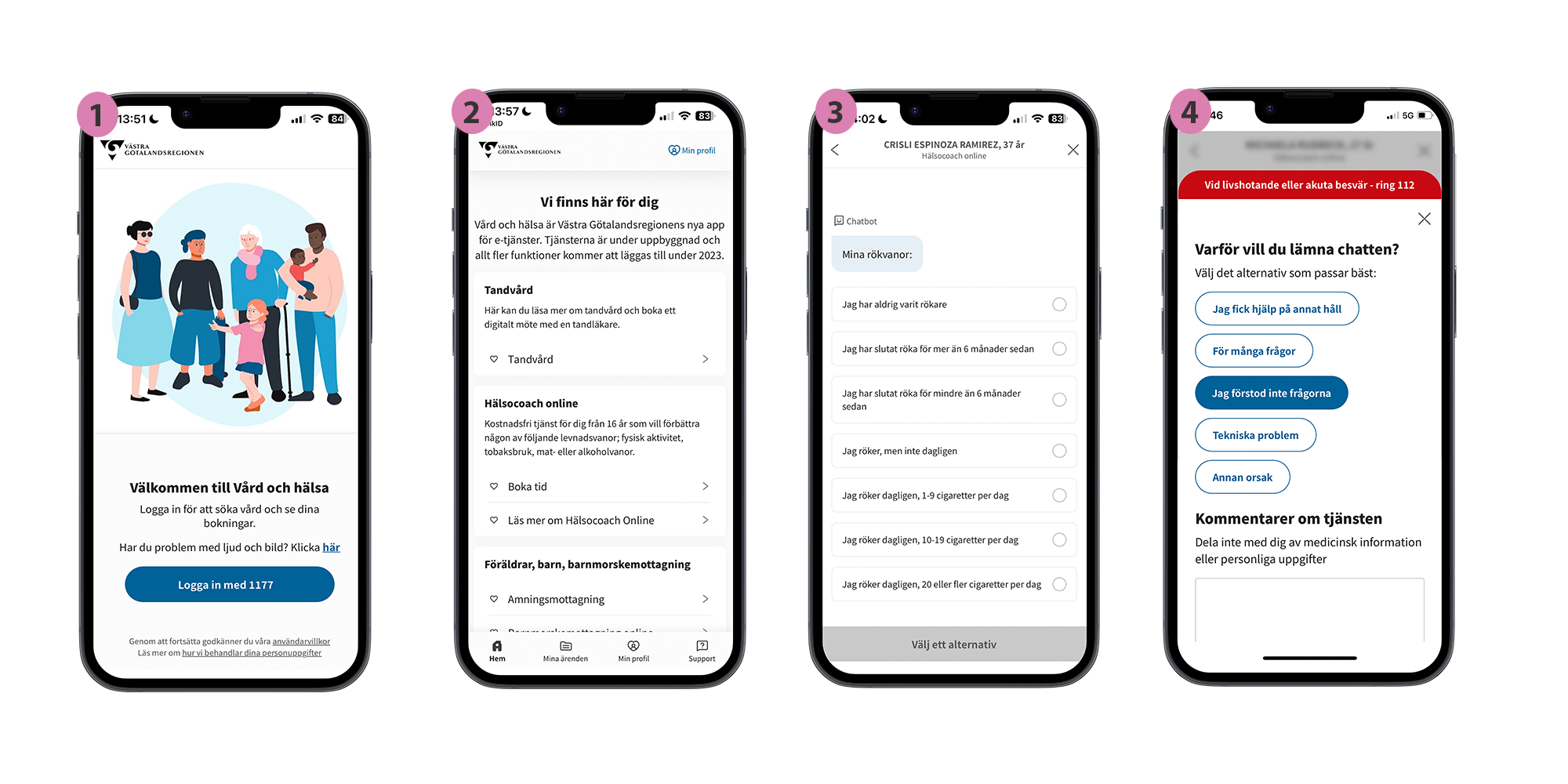
1. This is the log in page
– No selectable languages or reading options to understand the information.
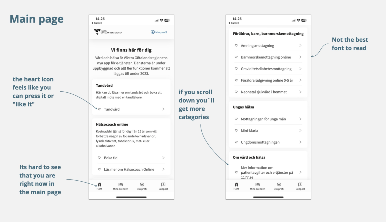
2. Main page
There’s a lot of information in a small space, and it’s not clearly delineated between the different categories. Additionally, having “My Profile” in two places can be confusing and may make users uncertain about their differences. Do they serve different purposes?
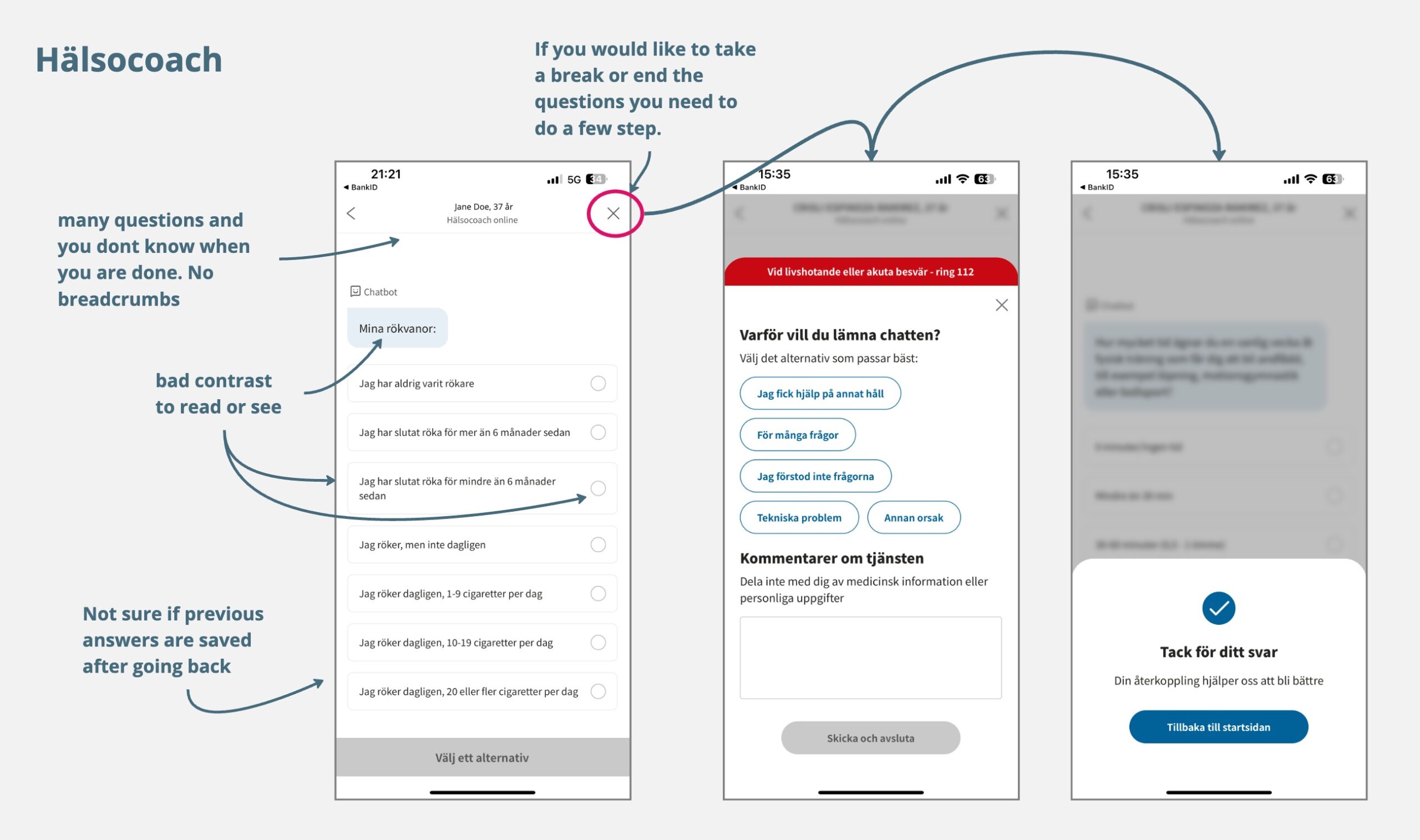
3. This is the Health Coach, a part of the VGR app where you can get help with lifestyle changes in your habits.
– You can’t see where you are in the form, how many questions you’ve answered, and how many questions are left. It might seem unclear that it looks like a chat, but it’s actually a form.
4. Leaving form
– When leaving the form, one must provide feedback to close it. Previous answers cannot be saved, and one must scroll down to even see the “submit and exit” button.
Deliver
Our suggestion
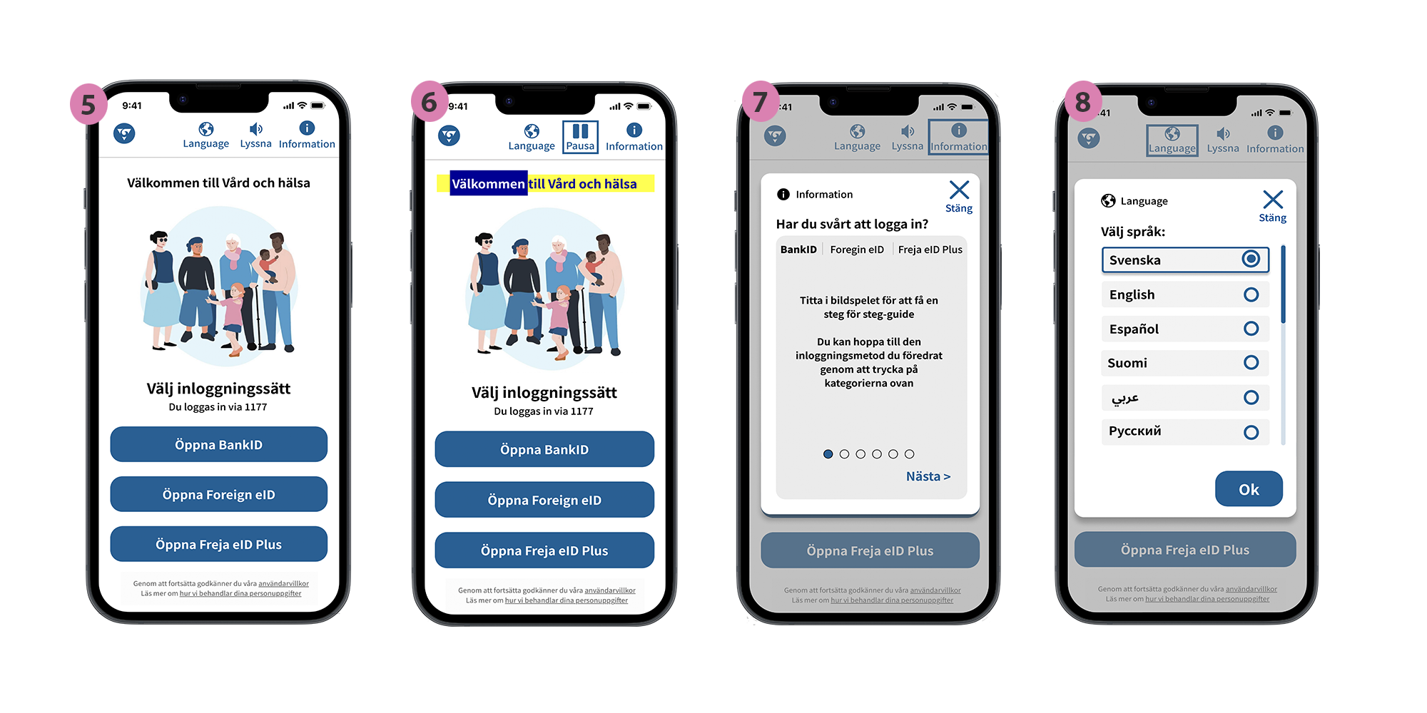
5. Overview
Able to change language, Screen reader, Information about how to log in and knowing what kind of login you are doing.
6. Screen reader
Able to pause or start. This feature is most useful as it provides the opportunity to listen to the content while simultaneously following the text
7. Bank ID,
It is not always obvious that everyone knows how to use BankID. Therefore, we have added a slideshow that informs how to log in with your BankID. There are also dots indicating how many slides there are and the word ’next’ because it is not always clear what these dots imply, especially for those who are not so tech-savvy
8. Change language
It was important for us that language plays a crucial role in the app, and it should be chosen right from the start on the homepage. The app becomes accessible for those who may not know Swedish
Deliver
Our suggestion
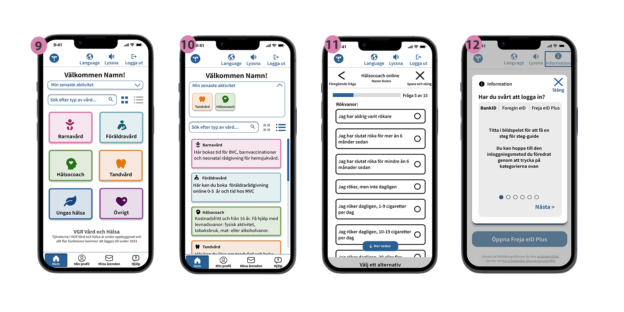
9. Main page view – Grid
– Search field available
– Grids with good contrast
– Current state indicate where you are.
– Option to log out
– Available to change view from grid to list
10. List view
List view with same contrast, and smaller information about every category
11. Survey
Two different breadcrumbs that shows where you are and how much you have left.
– Clickable home icon
– Go back to previous question
– The exit button is bigger size and you will know that it will
save your answers and that you can continue later.
12. Finishing survey
Options about what you want to do with the questions. You can choose to save and exit, exit without saving, or go back to the form.
TL;DR – All in all…. “ we want the app as a whole to be so user-friendly that
as few people as possible feel that it creates disabilities.
It should continue to be based on universal design so that all residents in VGR can use it on equal terms.”
Recomendation
So what now?
These are our improvement suggestions:
- The app significantly needs synchronization with the basic settings of mobile phones, such as dark mode, and zoom and magnification functions do not currently work.
- We need to test our solution with users from the target groups we have used as examples.
- In addition to this, more individuals with different functionalities and conditions should, of course, be included.
- Symbols and color schemes need to be tested, but discussions with VGR are also needed to categorize in the best way.
- The rest of the app needs to be continually reviewed and worked on. For example, the video meeting should be reconsidered, as well as how the app functions when a user is a representative for a child or another adult.
